Interfaces and product states
Compare error, success, warning, disabled, selected, and focus states to see whether meaning survives when hues become less distinct.
Explore how colors in an image may appear under four color vision approximations. This is a design preview, not a diagnosis or an exact copy of any person’s vision.
Your image stays on this device
Decoding, simulation, comparison, and PNG export happen in your browser. The image is not uploaded, stored, or included in analytics.
Choose one PNG, JPEG, or WebP image, paste an image, or start with our sample.
PNG, JPEG, or WebP · up to 20 MiB · up to 16.8 MP · 8192 px per side
You can also paste one image from the clipboard.
A color blindness simulator transforms an image to approximate how some color relationships can change under common color vision difference models. It lets designers compare the same interface, chart, map, illustration, or photograph without changing the source file.
This page is an educational design aid. It previews image pixels; it does not test your eyesight, identify a color vision condition, or reproduce exactly what another person sees.
Want to check your own red-green color recognition instead? Use our short, non-diagnostic screening test.
Take the color blindness screening testUse the preview early in design and again before release. It is especially useful when color carries status, category, direction, or emphasis.
Compare error, success, warning, disabled, selected, and focus states to see whether meaning survives when hues become less distinct.
Inspect series, legends, heatmaps, and small marks for colors that merge or become hard to trace.
Check routes, zones, labels, and annotations where a color-only distinction could hide important information.
Preview logos, calls to action, social graphics, and promotional images while keeping contrast and non-color cues in view.
Protan, Deutan, and Tritan are umbrella terms used here for model families, not a diagnosis of an individual. Select the mode that matches the color relationship you want to inspect.
An umbrella term for protanopia and protanomaly, involving the L-cone (long-wavelength) range. This mode applies a Machado red-cone difference approximation.
An umbrella term for deuteranopia and deuteranomaly, involving the M-cone (medium-wavelength) range. This mode applies a Machado green-cone difference approximation.
An umbrella term for tritanopia and tritanomaly, involving the S-cone (short-wavelength) range. This is a blue-cone difference approximation; evidence and individual experiences vary.
Uses a fixed luminance-preserving grayscale illustration. It does not simulate photophobia, visual acuity, nystagmus, or other real condition experiences.
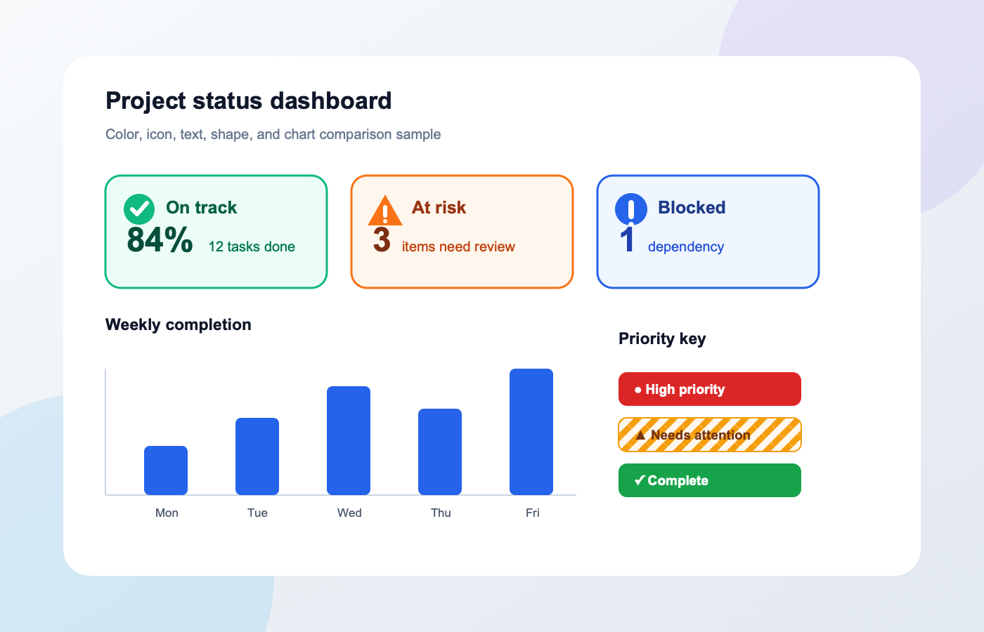
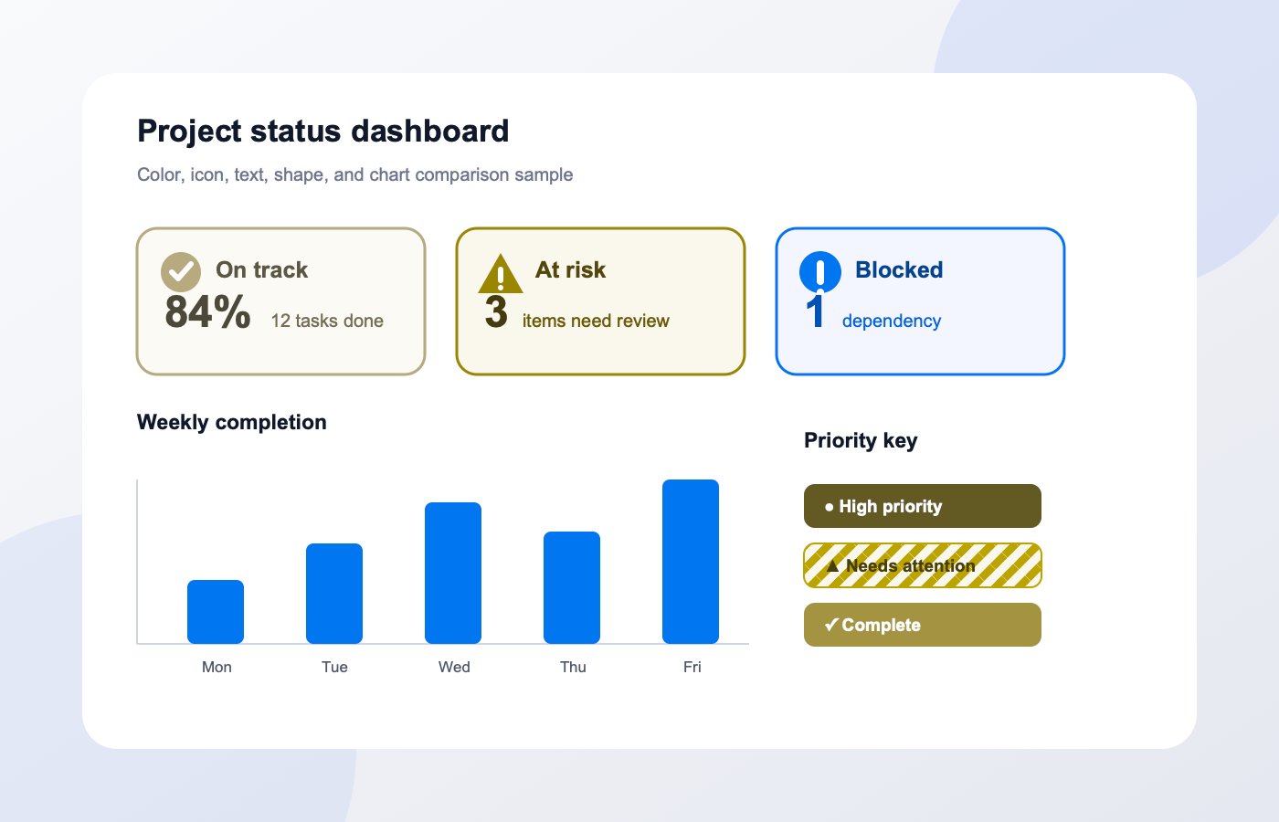
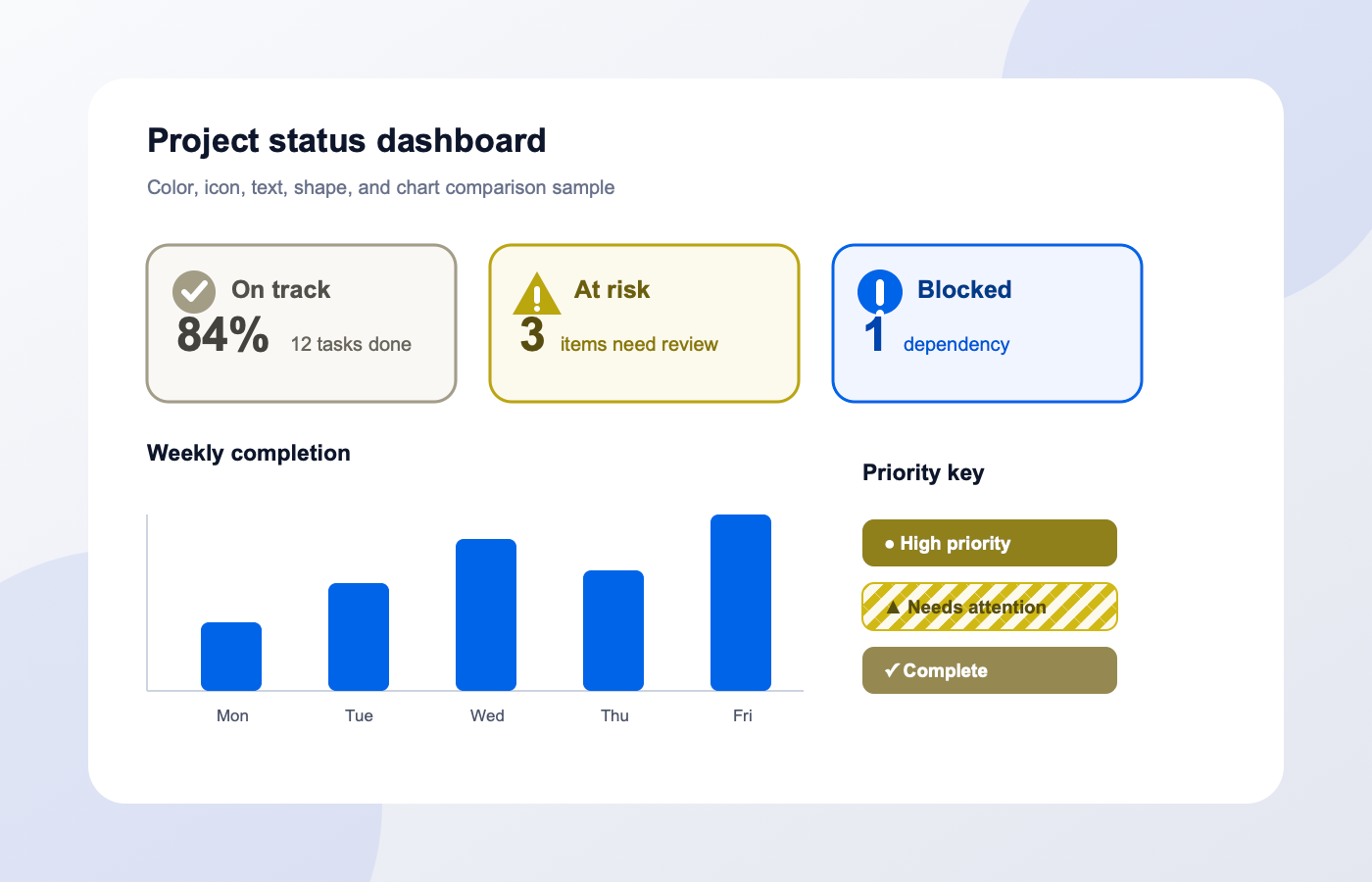
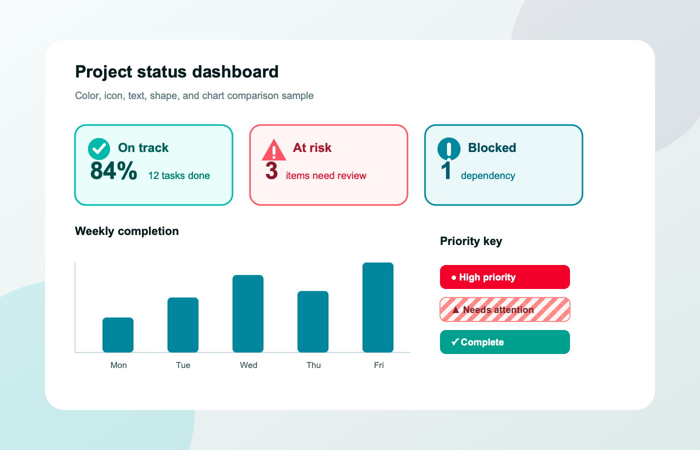
The panels use a fixed setting to make comparison easier. They are not exact representations of any individual’s vision.
Look for lost distinctions, not for a single pass-or-fail result. Compare each simulated view with the original at the size people will actually use.
Notice when adjacent controls, chart series, routes, or status colors become difficult to tell apart.
Check thin lines, small text, icons, borders, and muted states. A distinction visible in a large preview may disappear at its real size.
Add labels, icons, patterns, shapes, or stronger contrast, then preview again and validate with broader accessibility checks and user research.
Protan, Deutan, and Tritan use the precomputed matrices published by Machado, Oliveira, and Fernandes in 2009. Adjacent model samples are interpolated for the illustrative strength control, and colors are transformed in linear-light RGB while alpha is preserved. Achromatopsia uses a fixed relative-luminance grayscale illustration.
A simulation cannot reproduce exactly what a particular person sees. Individual vision, display calibration, color profiles, ambient light, image compression, and the model’s scope all affect the result. The Achromatopsia grayscale view also does not simulate photophobia, visual acuity, nystagmus, or other lived effects. This tool does not diagnose or classify a person, and it does not correct colors.
Treat simulation as one observation step, then verify the design with these practical checks.
No. The simulator changes image pixels for a design preview. A screening test asks you to identify visual targets and still cannot provide a medical diagnosis.
It is a model-based approximation, not an exact copy of anyone’s sight. Vision, screens, lighting, color profiles, and the image itself can all change the result.
The page includes Protan, Deutan, and Tritan model families plus one fixed Achromatopsia grayscale illustration. These modes do not identify a person’s condition.
It interpolates between published Machado matrix samples for an illustrative preview. The percentage does not measure or correspond to a person’s clinical severity.
Try all relevant modes and look for different failures. Protan and Deutan often reveal red-green distinctions, while Tritan explores a separate blue-yellow-related model range.
No. The image and derived pixels stay in the current browser session and are released when you reset, replace it, leave, or close the page.
This page uses one fixed luminance-preserving grayscale illustration. It does not model degrees of monochromacy, photophobia, visual acuity, nystagmus, or other lived effects.
No. Also inspect contrast and non-color cues, use automated and manual checks, and test with people. This preview is only one input.
The simulation method follows Machado, Oliveira, and Fernandes (2009). Health sources explain color vision deficiency and Achromatopsia; WCAG sources support the design guidance. These organizations have not reviewed or endorsed this site.
Educational design approximation only. Not a medical test, diagnosis, certification, or exact representation of an individual’s vision.